we are electricity human resources
with our members and partners our
mission is to strengthen the ability of
to meet current and future needs for a
highly skilled diverse and productive
as a national organization we work with
stakeholders across the country
to develop innovative resources and
programs to address national
provincial and regional issues and
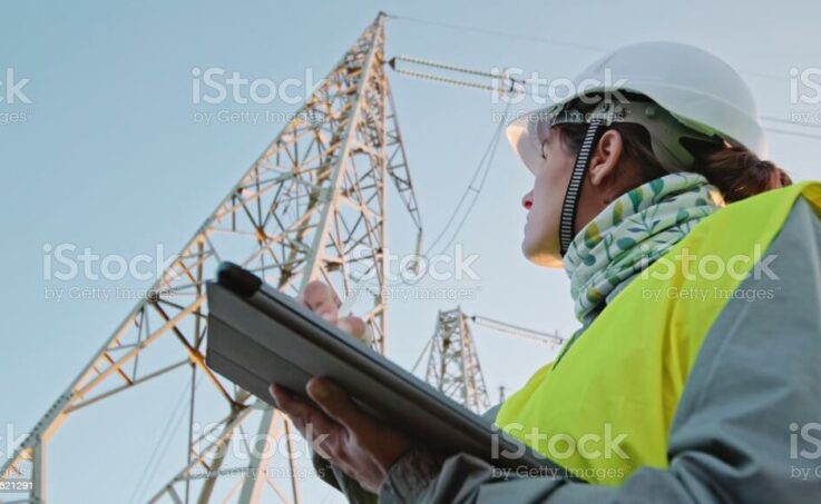
talent is at the core of the electricity
sector’s business operations and success
developing the supply of skilled and
experienced workers for both today
and tomorrow is critical to ensuring
electrical stability and sustainable
we are proud to work with industry to
prepare and build the workforce
that will lead them into the future
to be the best and brightest


